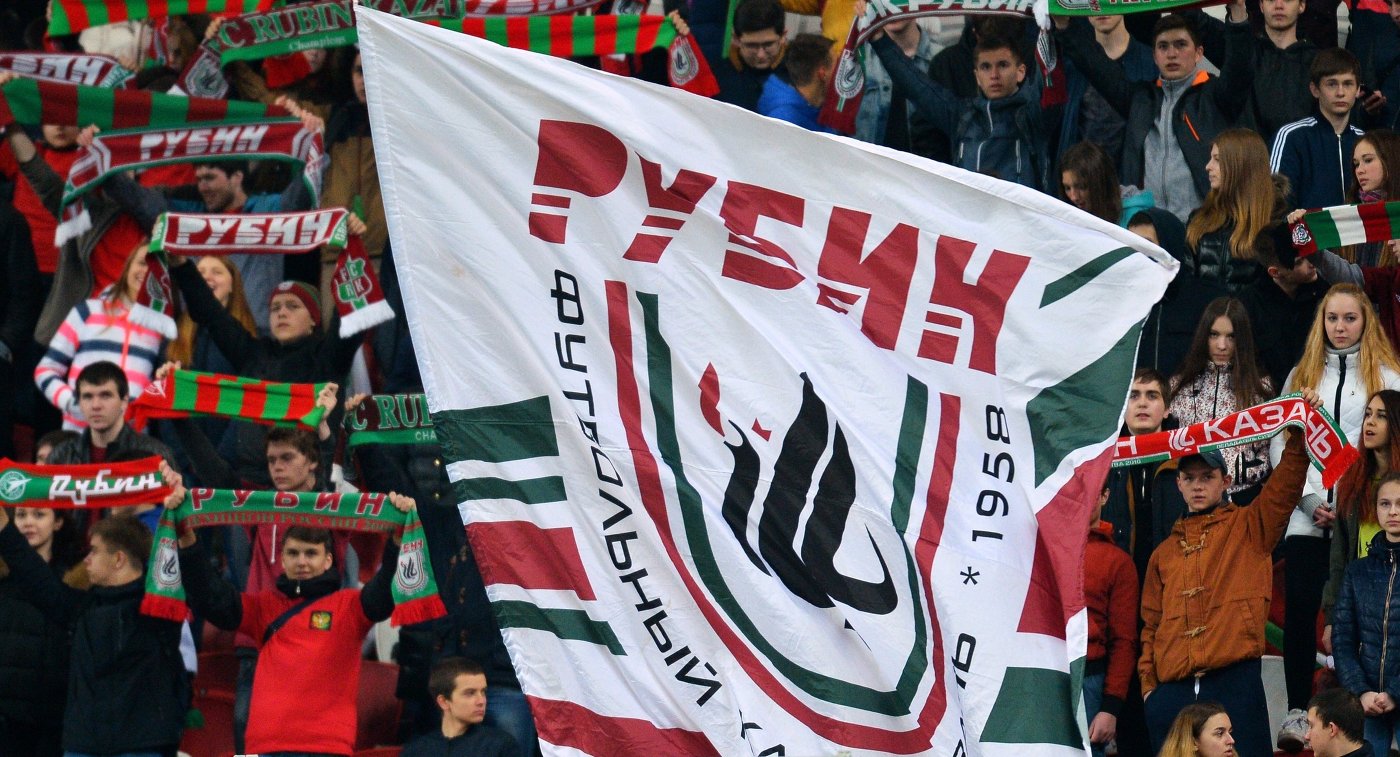
New brand for FC Rubin
In January 2016 Sellout Sport Systems approached me and offered to become an art-director, and later a designer in a project of developing a new brand of the FC Rubin. I certainly agreed. Rubin is the main football club of Kazan which won Russian football championship twice, won a game against Barcelona.
The project was going to be incredibly interesting though I realized that it would be hard work. My obligation was to not let fans down, after all they would have to wear clothes with the logo and associate it with their favorite team. Moreover, the logo would even appear in a new FIFA 2017 videogame!
1980

2013

1992
2012

1996
First of all I had to understand the issue as it was at that moment and it was the following: During previous several years Rubin changed their logo several times and the last one was highly criticized both by the club and people who simply liked football.
People refused to buy merchandise and eventually it became evident that it was absolutely necessary to create a new brand that would be accepted and loved by everyone. Well, seems clear, but how can it be done?


Evolution vs revolution
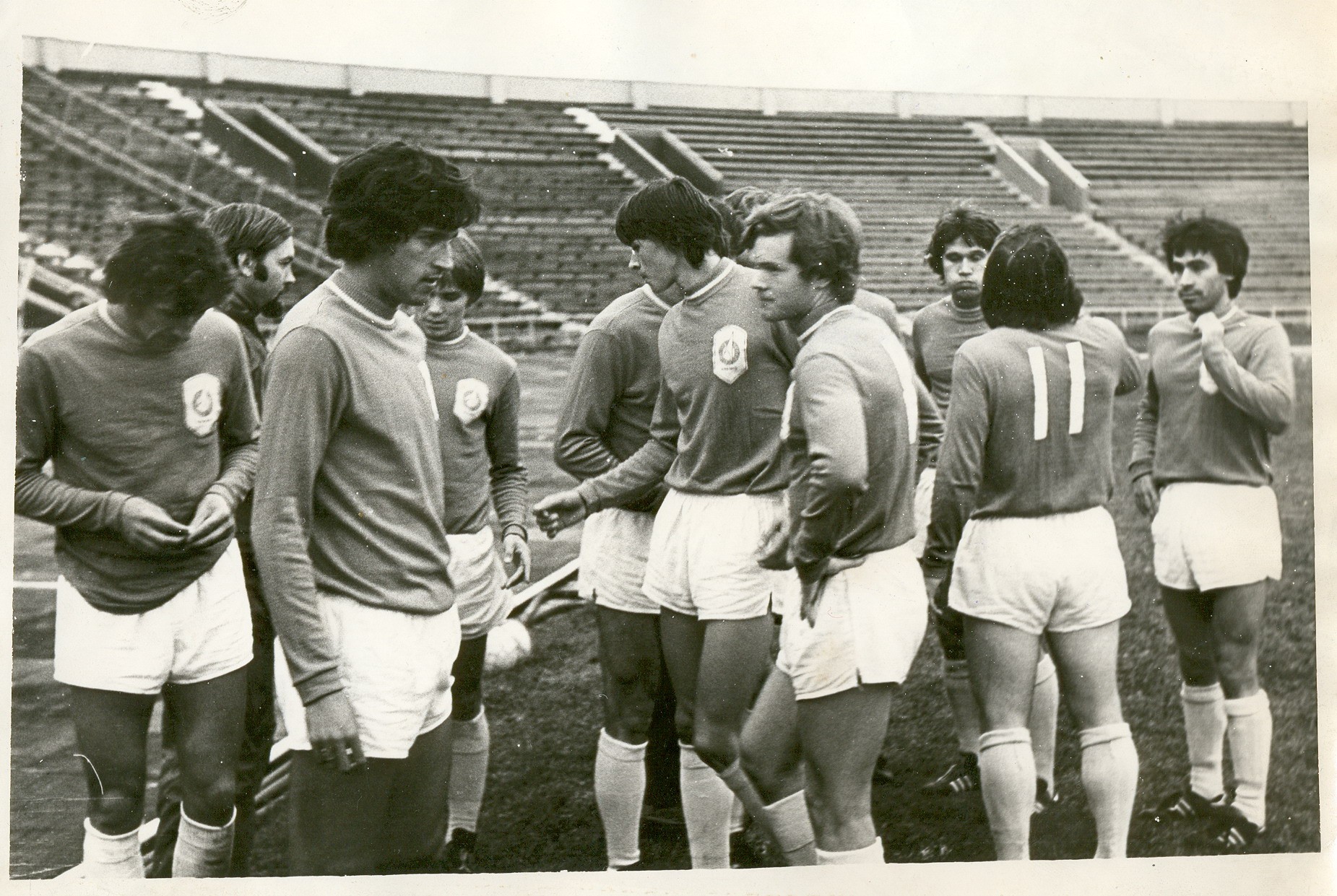
What needs to be understood is that tradition is very important in football. The club logo is not just an image on a shirt. It’s a symbol. That’s why I had to be very careful and pay attention to the tradition. If you look at the way how other football clubs changed their logos you can notice that they mostly use the evolutionary approach rather than revolutionary one. Logos slightly change and become more modern, not losing connection with previous versions.

Succession
Guys from Sellout Sport Systems had been working with Rubin and in sports marketing in general for quite a while so they really helped me during the stage of research. It was evident that we had to rely on an old 1996 loved version of the logo. We also realized that in future the logo would change and we needed to set the direction of that change. After gathering of all the necessary information I started the search for ideas.
?
→
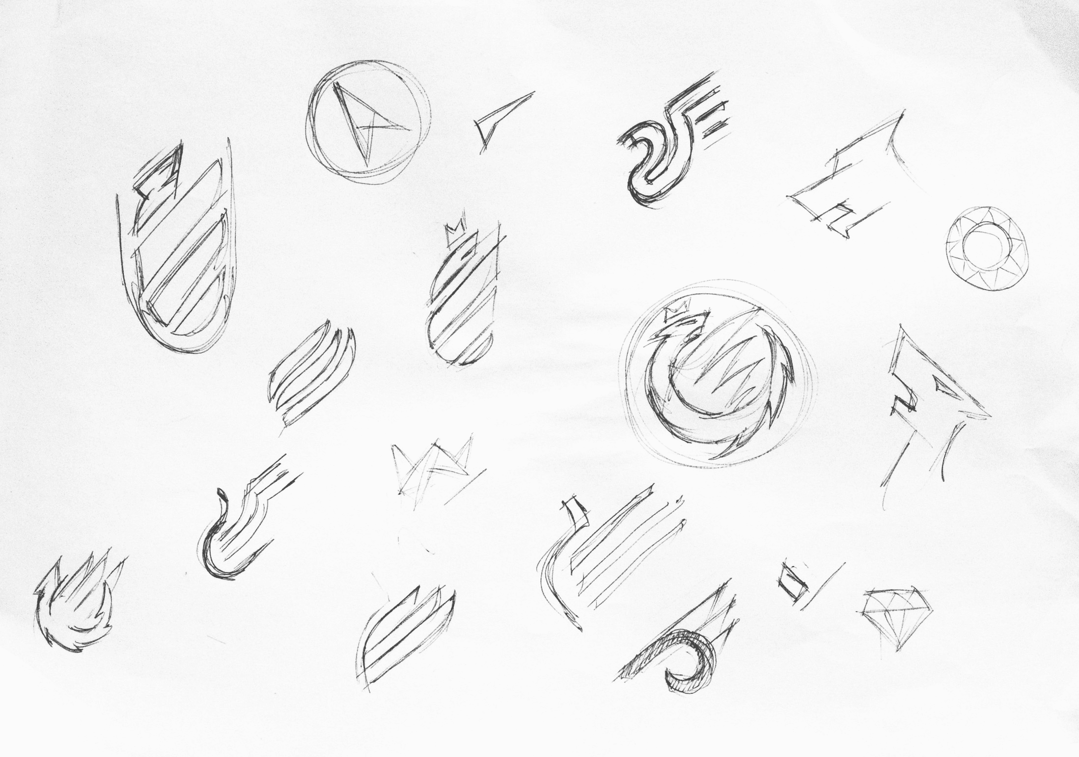
First sketches
Succession to the old logo was just one of the ways, but I had to look for some others. What if I returned to the circular shape which had been used in previous versions of the logo? Did you know, that the club had been named not after the precious stone but after a radar called Rubin which military planes of Kazan Aircraft production plant had been equipped with, where the club had originated? Perhaps I should have looked in this direction? And by the way people called the latest version of the logo “a rooster in borscht”, well, because it looked like one. I had to change that and bring the old “Zilant” dragon its recognizable appearance back.
I had lots of ideas. Some of them I drew on paper and some sketches I made in vector graphics. In the end there were several basic versions which we showed to the club management. Also we invited fans, leaders of fan movements and showed those versions to them. Vast majority agreed that the evolutionary version was what the club needed.
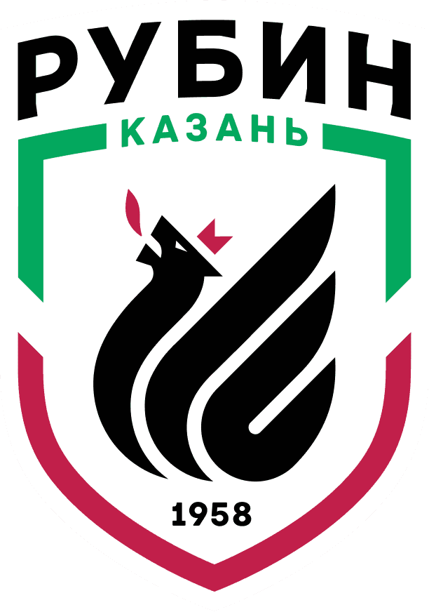
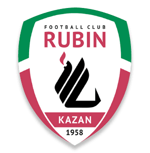
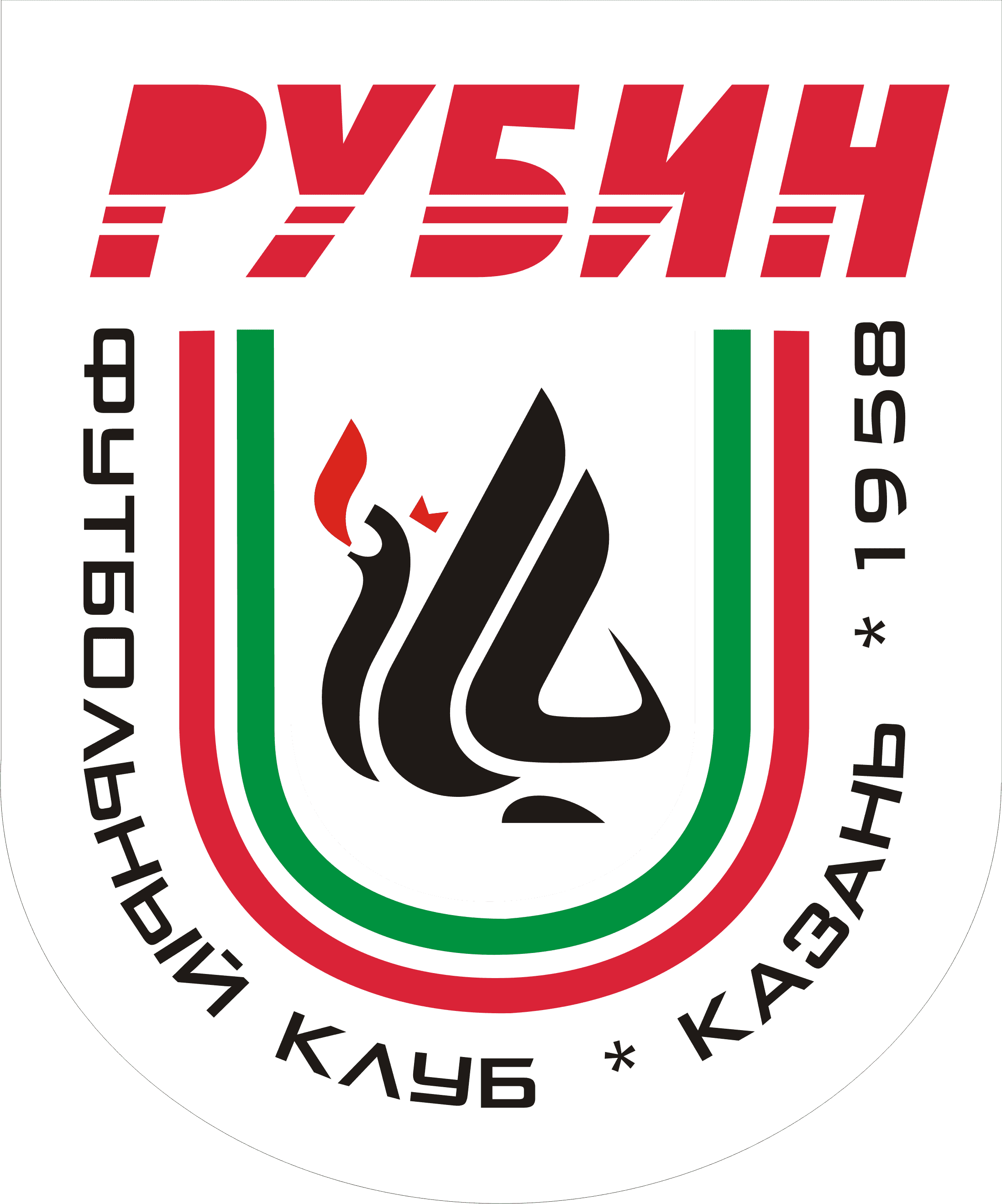
Finally the logo was accepted!
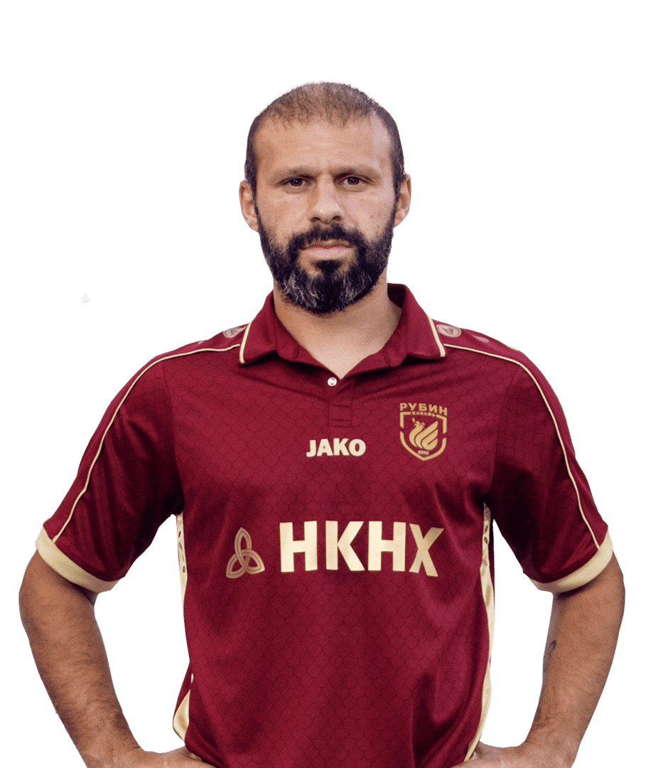
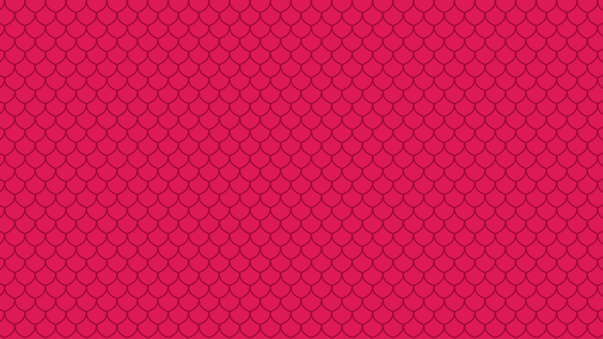
Pattern
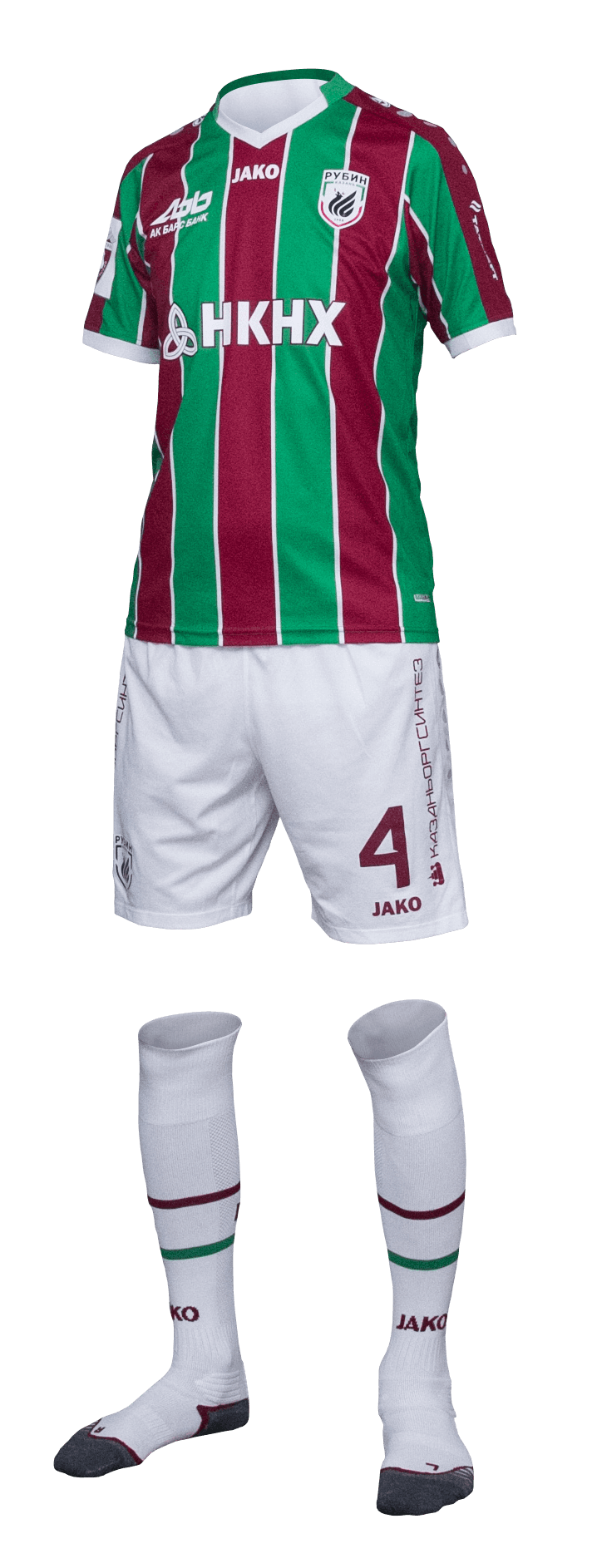
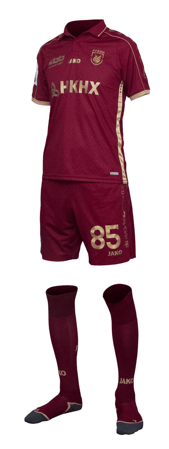
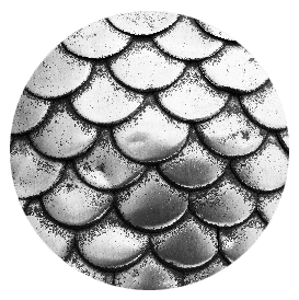
Also we wanted to find a solution that would allow to design a press-wall, merchandise and even a kit. After several days of research an idea came which put all the puzzle pieces together: a pattern which combines dragon scales, chain armour and a shape of the new logo. We immediately imagined how cool it would look on a kit


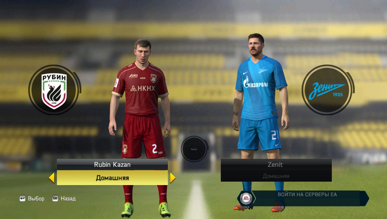
New kit